 AlpharvestPro
什麼是階段輪動圖?四階段市場閱讀指南
What Is a Stage Rotation Map? A Four-Stage Market Guide什麼是階段輪動圖?四階段市場閱讀指南
What a Stage Rotation Map Shows
A Stage Rotation Map is a research visualization for comparing market structure across major indices, sectors, themes, or ETF groups. Each point represents one series. Its location summarizes two related questions: is the long-term trend rising or falling, and is price positioned above or below that trend? An eight-week trail shows how the series arrived at its current position.
The map is descriptive rather than predictive. It does not estimate future returns, issue entries, or recommend securities. Its job is to put many series into the same visual frame so a researcher can compare direction, position, and change over time.
The Four Weinstein Stages
The stage names follow Stan Weinstein's framework in Secrets for Profiting in Bull and Bear Markets.
| Stage | Name | Structural reading |
|---|---|---|
| Stage 1 | Basing | The long-term trend is relatively flat while price forms a base around it. |
| Stage 2 | Advancing | Price and the long-term trend are moving in an advancing structure. |
| Stage 3 | Topping | Price is losing its prior advancing structure while the long-term trend has not fully turned down. |
| Stage 4 | Declining | Price and the long-term trend are moving in a declining structure. |
The stage badge is the classifier's authoritative output. A point can sit near a quadrant boundary while retaining its current stage; that disagreement is useful transition context, not an error. AlpharvestPro keeps the classifier's numeric calibration internal.
How to Read the Axes and Trail
The horizontal axis represents the direction of the long-term trend. Moving right means that trend is strengthening; moving left means it is weakening. The vertical axis represents price's position relative to the same trend. Moving up means price is farther above it; moving down means price is below it.
Read three things together:
- Current stage — the point color and stage label describe the present structural classification.
- Current position — the point's location shows trend direction and price position on a shared scale.
- Eight-week trail — the path shows whether the series is moving toward, away from, or along a stage boundary.
Always check the as-of date printed inside the map. Markets observe different holidays and source data can complete at different times, so two market maps do not always share the same final trading date.
Worked Example: Thematic ETF Groups
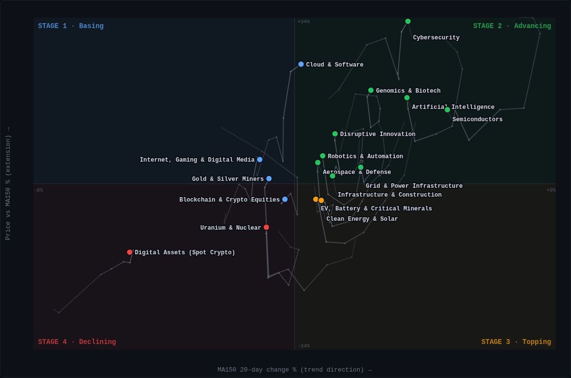
Suppose a thematic ETF group is labeled Stage 2 and its trail moves right while remaining above the horizontal center. The map is describing an advancing structure whose long-term trend direction has strengthened during the displayed weeks. If the trail later bends left or down, that describes a change in structure; it does not by itself predict the next return.
Compare the map with the accompanying ranking table and heatmap. The ranking supplies current relative context, the heatmap shows the session's breadth, and the Stage Rotation Map supplies the longer-horizon path. No single view should be treated as a stand-alone signal.
Explore the Live Maps
- US thematic ETF rankings and Stage Rotation Map — 17 thematic ETF groups.
- US ETF Momentum Dashboard — US ETFs in the dated report universe and broad category rankings.
- US and Japan heatmaps + Stage Rotation Maps — S&P 500 and JPX-Nikkei 400 display page.
- Taiwan and Hong Kong heatmaps + Stage Rotation Maps — TW200 and HSLMI display page.
- Four-market map hub — links to all display surfaces.
- How to Read Stock Market Heatmaps — daily breadth and sector context.
The four-market rotation set covers 60 major-index, sector, and thematic series: 21 US, 22 Japan, 9 Taiwan, and 8 Hong Kong. Counts describe the published comparison set, not an investable universe or performance claim.
FAQ
Is a Stage Rotation Map a forecast?
No. It describes current and recent market structure. It does not estimate future returns or predict when a stage will change.
Why can a point and its quadrant appear to disagree?
The point color comes from the stage classifier, while position comes from two continuous measurements. Near a boundary, the two can differ temporarily; that is transition context rather than a rendering error.
How often do the maps update?
They refresh after the relevant source market data completes. Use the as-of date inside each map rather than assuming all markets share one date.
Is the map investment advice or a trading signal?
No. It is an educational research visualization for comparing structure and momentum. It is not a recommendation, solicitation, forecast, or trading signal.
階段輪動圖呈現什麼
階段輪動圖是用來比較主要指數、產業、主題或 ETF 群組市場結構的研究視覺化。每個點代表一個序列,其位置同時回答兩個相關問題:長期趨勢正在走強或走弱,以及價格位於該趨勢之上或之下。8 週軌跡則顯示該序列如何移動至目前位置。
這張圖是描述工具,不是預測工具。它不估算未來報酬、不提供進場指示,也不推薦證券。用途是把多個序列放在同一視覺架構中,方便比較方向、位置與一段時間內的變化。
Weinstein 四階段
階段名稱依據 Stan Weinstein 在 Secrets for Profiting in Bull and Bear Markets 提出的架構。
| 階段 | 名稱 | 結構解讀 |
|---|---|---|
| Stage 1 | 築底期 | 長期趨勢相對平坦,價格在其附近建立底部。 |
| Stage 2 | 上升期 | 價格與長期趨勢處於上升結構。 |
| Stage 3 | 頭部期 | 價格逐漸失去原有上升結構,而長期趨勢尚未完全轉弱。 |
| Stage 4 | 下降期 | 價格與長期趨勢處於下降結構。 |
階段標籤是分類器的正式輸出。當一個點接近象限邊界時,位置與目前階段可能暫時不同;這是觀察轉換的背景,不是繪圖錯誤。AlpharvestPro 不公開分類器的數值校準。
如何閱讀座標軸與 8 週軌跡
橫軸代表長期趨勢方向。向右移動表示趨勢方向增強,向左表示減弱。縱軸代表價格相對同一長期趨勢的位置;向上表示價格位於趨勢之上,向下表示位於趨勢之下。
請同時閱讀三項資訊:
- 目前階段 — 點的顏色與階段標籤描述目前結構分類。
- 目前位置 — 點的位置以共同尺度呈現趨勢方向與價格位置。
- 8 週軌跡 — 路徑顯示序列正接近、遠離或沿著階段邊界移動。
務必查看地圖內的資料日期。各市場休市日不同,來源資料完成時間也不同,因此不同市場地圖不一定具有相同的最後交易日。
範例:主題 ETF 群組
假設某個主題 ETF 群組標示為 Stage 2,軌跡維持在水平中心線之上並向右移動。地圖描述的是一個上升結構,且長期趨勢方向在顯示期間內增強。如果軌跡之後轉向左方或下方,代表結構發生變化;它本身並不預測下一期報酬。
可搭配排行表與熱力圖閱讀。排行提供目前相對背景,熱力圖呈現當日市場廣度,階段輪動圖則補充較長期軌跡。任何單一視圖都不應被視為獨立交易訊號。
查看即時地圖
- 美國主題 ETF 排行與階段輪動圖 — 17 個主題 ETF 群組。
- 美國 ETF 動能儀表板 — 報告範圍內的美國 ETF 與大類排行。
- 美國與日本熱力圖及階段輪動圖 — S&P 500 與 JPX 日經 400。
- 台灣與香港熱力圖及階段輪動圖 — TW200 與 HSLMI。
- 四市場地圖入口 — 連結所有顯示頁面。
- 如何閱讀股市熱力圖 — 當日廣度與產業背景。
四市場輪動圖共涵蓋 60 個主要指數、產業與主題序列:美國 21、日本 22、台灣 9、香港 8。這些數量描述公開比較集合,不代表可投資範圍或績效主張。
常見問題
階段輪動圖是預測工具嗎?
不是。它描述目前與近期市場結構,不估算未來報酬,也不預測階段何時改變。
為什麼點的顏色與所在象限有時不同?
點的顏色來自階段分類器,位置來自兩項連續測量。接近邊界時可能暫時不同;這是轉換背景,不是繪圖錯誤。
地圖多久更新一次?
地圖會在相關市場來源資料完成後更新。請查看每張圖內的資料日期,不要假設所有市場日期相同。
這是投資建議或交易訊號嗎?
不是。這是比較市場結構與動能的教育研究視覺化,不是推薦、招攬、預測或交易訊號。
Public preset library / プリセット一覧 / 篩選預設條件庫 · Data coverage / データの対象範囲 / 資料範圍
This content is for educational and informational purposes only. It does not constitute financial advice, investment recommendations, or solicitation to buy or sell securities.
AlpharvestPro VIP | Japan & US Reports | Taiwan & HK Reports